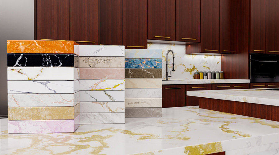
Choosing among quartz countertop colors is about more than picking a shade that looks attractive in a showroom. The right color can influence how spacious a kitchen feels, how cabinetry connects with the rest of the room, and whether a countertop remains visually appealing as design preferences change.
Hyundai L&C offers a broad HanStone Quartz color portfolio that gives homeowners and designers options ranging from understated neutrals to dramatic veined surfaces.
Why Quartz Countertop Colors Matter in Interior Design
A countertop often occupies a significant visual area in a kitchen or bathroom. Because of that, its color can become a foundation for the entire design rather than a small finishing detail.
Quartz is particularly versatile because engineered surfaces can offer consistent color, controlled patterns, and designs inspired by natural stone. This allows homeowners to achieve the visual character they want while considering the practical demands of an everyday surface.
Color also affects how other materials appear. A warm quartz surface can complement wood cabinetry and brass hardware, while a crisp white surface can create contrast against darker cabinets. Gray, beige, cream, and stone-inspired patterns can provide a middle ground when a space needs balance.
The goal is not necessarily to choose the most dramatic countertop. It is to select a surface that works with the room’s architecture, lighting, cabinetry, flooring, and long-term design direction.
Popular Quartz Countertop Colors for 2026
Current quartz design is moving beyond a strict preference for cool whites and gray tones. Warmer neutrals, organic movement, and natural-looking veining are increasingly important in contemporary interiors. HanStone’s 2026 offerings reflect this shift with surfaces designed around warmth, fluidity, and understated visual depth.
Here are several directions worth considering.
Warm Beige and Golden Tones
Warm neutrals can make kitchens and bathrooms feel more inviting without becoming visually heavy. They work especially well with natural wood, cream cabinetry, warm metals, and earthy flooring.
Avora is one example of this direction. Its warm golden tones, flowing movement, and layered appearance create a softer alternative to stark white surfaces.
For homeowners who want a welcoming kitchen with a natural visual character, warm quartz can provide an effective foundation.
White Quartz With Subtle Veining
White remains a practical design choice because it can brighten a space and work with numerous cabinet and backsplash combinations. However, completely plain white is not the only option.
Subtle veining adds movement while maintaining an overall light appearance. Strivento, for example, combines a creamy-white background with delicate streaks and gentle movement. The result is expressive without overwhelming surrounding design elements.
This type of surface can work particularly well when the countertop needs to feel distinctive but still adaptable.
White Quartz With Bold Veining
For a stronger focal point, consider quartz with pronounced veining. These surfaces can create the visual impact associated with marble while giving designers a controlled engineered pattern.
Calacatta Gravo features soft gray veining across a luminous white foundation, while Calacatta Mont combines a white base with intricate warm and gray veining. Both demonstrate how movement can become a major design feature rather than simply a background detail.
Bold veining can be especially effective on kitchen islands, where the larger surface area allows the pattern to become part of the room’s visual architecture.
Gray and Deep-Toned Quartz
Gray remains useful when a room needs a more grounded palette. Depending on the undertone, gray quartz can appear cool, warm, industrial, or sophisticated.
Deeper surfaces can create contrast against lighter cabinetry and walls. However, darker quartz should be evaluated in the actual room because lighting has a significant effect on how the surface reads throughout the day.
How to Choose the Right Quartz Countertop Color
A countertop should be evaluated as part of the entire room rather than in isolation. Before selecting a color, consider these factors.
1. Start With Permanent Design Elements
Look at flooring, cabinetry, wall colors, backsplashes, and architectural features first. These elements can be more difficult or expensive to replace than a countertop.
If the cabinetry has a strong wood grain, a quieter quartz pattern may provide balance. If the cabinets are simple and understated, a veined surface can introduce more visual interest.
2. Identify the Room’s Undertones
Two surfaces may both appear white but have very different undertones. One can lean warm and creamy, while another may appear cooler and brighter.
Compare samples alongside cabinet doors, flooring, paint, and backsplash materials. This is more reliable than choosing a color from a digital image alone.
3. Consider Natural and Artificial Lighting
Lighting can dramatically change the appearance of quartz. Morning sunlight, afternoon light, warm LEDs, and cool LEDs may all influence how the surface looks.
Place a physical sample in the intended space whenever possible. Observe it at different times of day before making a final decision.
4. Think About Pattern Movement
Not every veined quartz surface behaves the same way visually. Some patterns are subtle and consistent, while others feature strong movement that naturally draws attention.
For large islands and expansive countertops, review the full slab whenever possible. A small sample may not reveal how the pattern travels across the entire surface.
5. Coordinate Rather Than Match Everything
A common design mistake is trying to make every material identical. Instead, aim for coordination.
A countertop can repeat a subtle tone from the flooring or backsplash without exactly matching it. This approach creates visual connection while allowing individual materials to retain their character.
Quartz Countertop Colors for Different Design Styles
Different interior styles can call for different approaches to color and pattern.
Modern kitchens: Crisp whites, restrained gray tones, and clean veining can support a streamlined aesthetic.
Warm contemporary spaces: Cream, beige, and golden undertones can pair naturally with wood cabinetry and softer finishes.
Classic interiors: Marble-inspired whites with refined veining can provide a timeless appearance.
High-contrast designs: Darker surfaces or dramatic veining can create a focal point against light cabinetry.
Organic-inspired spaces: Warm neutrals and flowing patterns can complement natural textures, wood, stone, and muted finishes.
The key is to select the color based on the design language of the room rather than choosing a trend simply because it is popular.
Look Beyond Color When Comparing Quartz
Color may be the first thing that catches your attention, but performance should also influence the final decision.
A countertop is a working surface. Kitchens encounter food preparation, spills, cookware, cleaning, and everyday traffic, while bathroom countertops face moisture, cosmetics, and frequent use.
When comparing quartz surfaces, consider:
- Surface pattern and visual consistency
- Available slab dimensions
- Finish options
- Thickness choices
- Maintenance requirements
- Sample availability
- Warranty coverage
- Fabrication and installation requirements
HanStone Quartz provides product information and resources that can help homeowners, designers, fabricators, and other professionals evaluate available surfaces before making a selection. Its 2026 materials also identify options with features such as recycled content, leather finishes, and Next Generation Quartz offerings.
Why Samples Are Essential Before You Buy
Online galleries are useful for narrowing down options, but they cannot fully reproduce the appearance of a countertop in a specific room.
A physical sample can reveal details that may be difficult to see on a screen, including undertones, veining, texture, and how the surface interacts with surrounding materials.
For example, a warm white quartz may look neutral against a showroom background but appear noticeably creamier beside bright white cabinets. A gray-veined surface may also look more pronounced when placed beside a simple backsplash.
When possible, review your preferred sample alongside:
- Cabinet doors
- Flooring
- Backsplash materials
- Wall paint
- Hardware and fixtures
This simple comparison can prevent an expensive mismatch later.
Make Quartz Countertop Colors Work for Your Space
The best quartz countertop colors are not necessarily the ones receiving the most attention online. They are the colors that support the way a room is designed, used, and experienced.
In 2026, warmer neutrals, natural-looking movement, and refined veining offer homeowners more ways to create spaces that feel both current and enduring. The growing range of engineered quartz designs also makes it possible to approach countertop selection with greater precision, from subtle creamy surfaces to statement-making marble-inspired patterns.
Start with the room’s existing elements, evaluate undertones under real lighting, and use physical samples before committing. Most importantly, consider the countertop as part of a complete design rather than an isolated purchase.
With the right quartz countertop color, a kitchen or bathroom can achieve a cohesive look that feels intentional today and remains comfortable to live with for years to come.
To compare current HanStone Quartz colors, samples, and product resources, visit Hyundai L&C USA.